Introduction to Color Theory
Color theory studies how colors interact and how they have the potential to be used to create effective visual designs. It plays a crucial role in graphic design, web design, and other visual disciplines, as color can evoke emotions, communicate meaning, and establish brand identity. Understanding color theory involves learning about color properties, such as hue, saturation, brightness, color harmonies, and the psychological effects of different colors. By mastering the principles of color theory, designers can create eye-catching, visually appealing designs that communicate their intended message effectively. Whether working with a limited color palette or a full spectrum of hues, a solid understanding of color theory is essential for any designer looking to create effective visual designs.
The Psychology of Color
Understanding the psychology of color is crucial in creating impactful designs, as colors can evoke emotions and moods in individuals. For example, red is often associated with passion, excitement, and energy, while blue is associated with calmness, trust, and professionalism. By understanding these associations, designers can use color strategically to evoke specific emotions and create an intended mood.
Culture and personal experience can influence the psychology of color, so designers must consider the context and audience when using color in the design. For instance, many Western cultures associate white with purity and innocence, but some Asian cultures associate it with death and mourning.
In addition to understanding the emotions and moods associated with different colors, designers must also consider how colors interact. Color harmonies, or combinations of colors that work well together, are based on color theory and can create a sense of balance and cohesion within a design.
Ultimately, the psychology of color can be a powerful tool for designers looking to create impactful visual designs. By considering the emotional associations of different colors and using color harmonies strategically, designers can create designs that look great and communicate their intended message effectively.
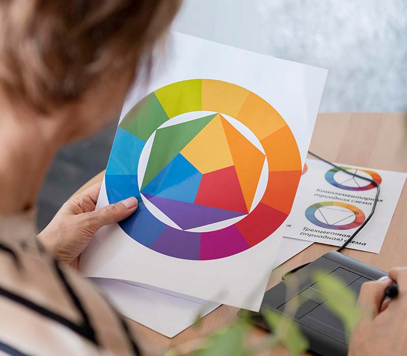
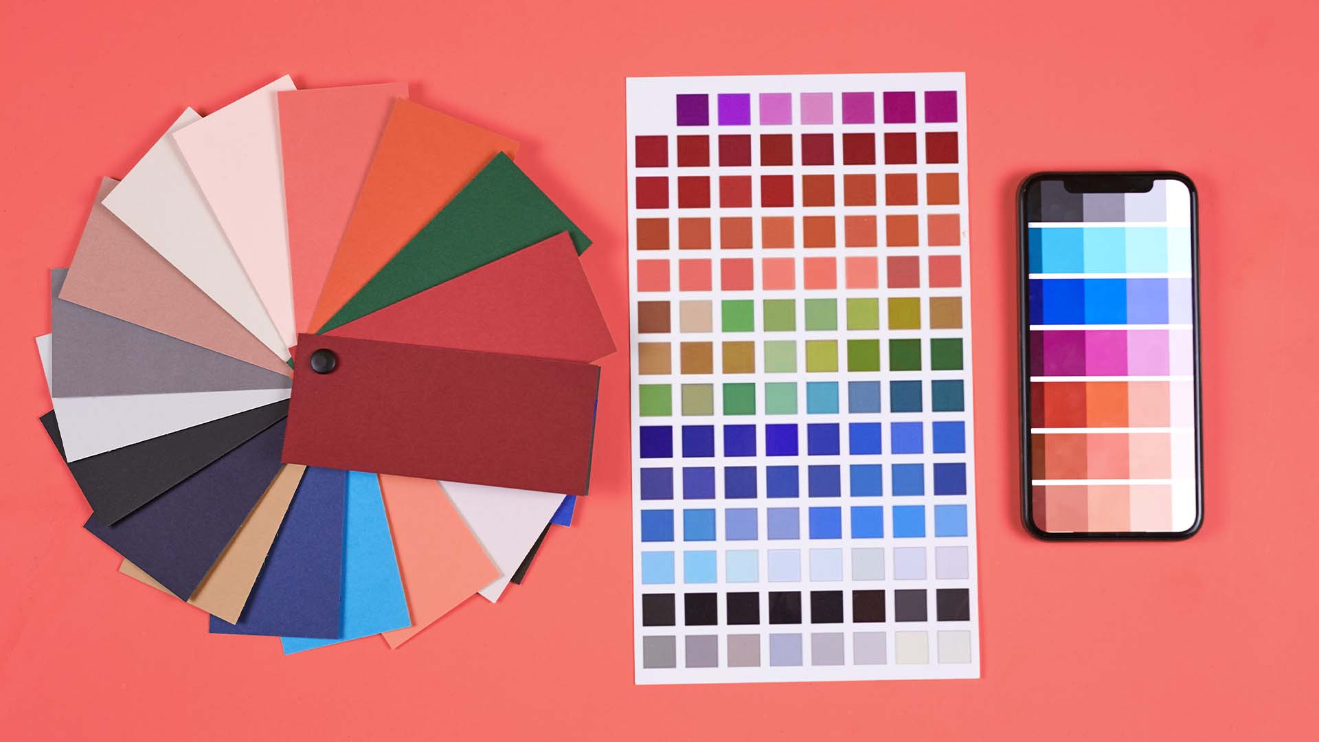
Color Harmonies

Color harmonies are combinations of colors that work well together and create a sense of balance and cohesion within a design. Understanding color harmonies is essential to color theory and can help designers create visually appealing designs that communicate their intended message effectively.
Several types of color harmonies exist, including complementary, analogous, triadic, and monochromatic. Complementary color harmonies involve colors opposite each other on the color wheel, such as red and green or blue and orange. Analogous color harmonies include colors next to each other on the color wheel, such as red, orange, and yellow. Triadic color harmonies involve three colors evenly spaced on the color wheel, such as red, blue, and yellow. Finally, monochromatic color harmonies involve different shades and tints of a single color.
When using color harmonies in design, it's essential to consider the context and purpose of the design. For example, complementary color harmonies can create a sense of contrast and energy, while analogous color harmonies can create a sense of harmony and balance. By understanding the different color harmonies and how they can be used to achieve other effects, designers can create visually appealing designs that effectively communicate their intended message.
Color Contrast

Color contrast is a fundamental aspect of color selection in design, as it can help create emphasis, hierarchy, and visual interest within a design. Therefore, understanding the importance of color contrast and how to use it effectively is essential for any designer.
Color contrast involves using different colors or shades to create a visual separation between other elements within a design. This can be achieved through hue, saturation, brightness, or value differences. For example, using a light color against a dark background creates a high contrast, while using two similar colors with little contrast can make sense of monotony and lack of interest.
When using color contrast in design, it's important to consider the purpose and context of the design. For example, high contrast can help create emphasis and hierarchy within a design, such as using a bright color for a call-to-action button on a website. However, in some cases, low contrast can also be effective, such as using a subtle gradient to create a sense of depth and dimension in a design.
Color in Branding
Color plays a critical role in brand identity and recognition, as it can help establish a brand's personality and differentiate it from competitors. When used effectively, color can become a powerful tool for creating a lasting impression on consumers.
Many well-known brands have used color to significant effect in their branding efforts. For example, the iconic Coca-Cola logo is recognized worldwide for its distinctive red and white color scheme, which helps convey a sense of energy and excitement. Similarly, Starbucks's green and white color scheme has become synonymous with the brand's commitment to sustainability and ethical sourcing.
Considering the brand's personality, values, and target audience is important when selecting colors for a brand's visual identity. For example, a brand targeting a younger demographic might choose bright, energetic colors. In contrast, more subdued colors might be opted for by a brand targeting a more mature audience.
Using Color in Typography

Color can be used effectively in typography to create a visually appealing and readable design. When used correctly, color can help draw the reader's attention to important information, highlight key points, and improve overall readability.
When using color in typography, it's essential to consider the overall design aesthetic and purpose. For example, a website aimed at children might use bright, bold colors to make the text more engaging and playful, while a website aimed at a professional audience might opt for more subdued colors to convey a sense of sophistication and professionalism.
Contrast is also important when using color in typography. High contrast between the text and the background can improve readability, while low contrast can make the text difficult to read. Additionally, designers should be mindful of their chosen color palette and ensure that it is harmonious and cohesive with the overall design.
Color and Accessibility
Accessibility is an important consideration in design, and color is no exception. For users with visual impairments, such as color blindness or low vision, using color effectively can be challenging. However, by following simple guidelines, designers can ensure their designs are accessible to all users.
One key consideration when using color in design is contrast. High contrast between the text and background can improve readability for users with visual impairments. Additionally, designers should ensure that they use color in a way that is not the sole method of conveying information. When indicating links on a website, it's best to use both color and a visual cue like an underline to make it clear to users.
Designers can also use tools and resources to ensure their designs are accessible. For example, many color contrast calculators are available online that can help determine whether the contrast between two colors is sufficient for accessibility. Additionally, there are guidelines and standards, such as the Web Content Accessibility Guidelines (WCAG), that provide recommendations for using color in an accessible way.
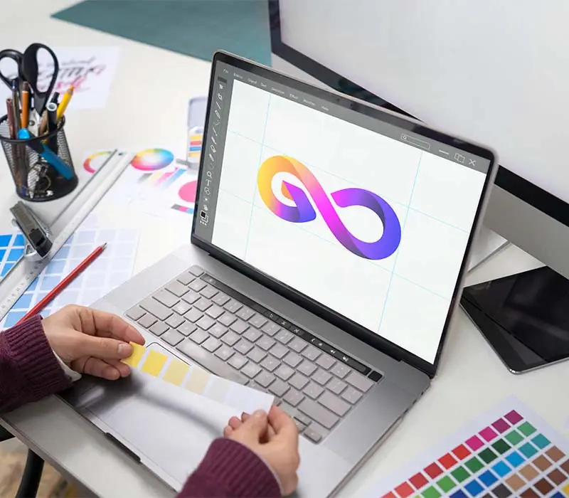
Tools for Working with Color

Many different tools and resources are available for designers to work with color, each with unique features and benefits. One popular tool for working with color is Adobe Color, which allows designers to create custom color palettes and explore different color harmonies. With Adobe Color, designers can upload an image and extract a color palette based on the colors in the image, making it a helpful tool for creating harmonious and cohesive designs.
Another popular tool for working with color is Color Hunt, a curated collection of color palettes created by designers worldwide. Color Hunt is an excellent resource for designers looking for inspiration and exploring different color combinations.
In addition to these tools, many other resources are available for working with colors, such as color wheels, color guides, and color theory books. These resources can help designers better understand color theory and how to use color effectively in their designs.
Applying Color Theory in Practice

Applying color theory is crucial for creating effective visual designs that resonate with the intended audience. There are countless examples of how designers have successfully applied color theory to create engaging and memorable designs across various industries.
One example is the use of color in branding. Brands like Coca-Cola and McDonald's use red in their logos and marketing materials to convey energy, excitement, and passion. Meanwhile, brands like Apple and IBM use minimalist designs with a limited color palette to convey sophistication and elegance.
Another example is the use of color in website design. Designers use color to create a hierarchy, draw attention to crucial elements, and guide users through the website. For example, call-to-action buttons are often designed in contrasting colors to encourage users to take action. At the same time, text is often created in a high-contrast color to improve readability.
Conclusion

In conclusion, we've explored the importance of color theory in digital design, including the psychology of color, color harmonies, contrast, branding, typography, accessibility, and tools for working with color. By understanding how to use color effectively, designers can create visual designs that are engaging, memorable, and effective.
As you progress with your designs, consider the key points discussed in this post and how you can apply them to your work. For example, experiment with different color harmonies, consider the emotions and moods associated with different colors, and pay attention to contrast and accessibility. You can create designs that resonate with your intended audience with the right tools and resources.